Ch11 Why Model?
Data cannot speak for themselves, 所以我们需要简单非参数模型到各种参数模型。本文的内容如下:
教材对应章节的内容摘要
教材中的 Programs
内容摘要
本章描述了本书 Part I 中使用的非参数估计量与 Part II 中使用的基于模型的参数估计量之间的区别。它还回顾了 smoothing 的概念,并简要回顾了任何建模决策中涉及的 bias-variance trade-off。本章motivates the need for models in data analysis,无论分析目标是因果推理还是预测。We will take a break from causal considerations until the next chapter. 请记住,有关建模的统计文献非常丰富;本章只能重点介绍一些关键问题。
Big Picturce:
非参数模型 –> parametric models –> structural mean models
Models for the marginal mean of a counterfactual outcome are referred to as marginal structural mean models.
Effect modification and marginal structural models 在上面的模型增加新的变量 for effect modification
Structural nested mean model 会有一个对比某个基准 potential outcome.
In Part II of this book we have described two different types of models for causal inference:
propensity models and
structural models.
Let us now compare them.
Propensity models are models for the probability of treatment \(A\) given the variables \(L\) used to try to achieve conditional exchangeability.
Structural models describe the relation between the treatment \(A\) and some component of the distribution (e.g., the mean) of the counterfactual outcome
Table of contents
Data cannot speak for themselves
Parametric estimators of the conditional mean
Nonparametric estimators of the conditional mean
Smoothing
The bias-variance trade-off
11.1 Data cannot speak for themselves
考虑一个研究总体,其中有16个人感染了人类免疫缺陷病毒(HIV)。与本书第一部分不同,我们不会将这些人视为 representatives of 1 billion individuals identical to them. Rather, these are just 16 individuals randomly sampled from a large, possibly hypothetical super-population: the target population.
在研究开始时,每个人都会接受一定程度的治疗 \(A\) (antiretroviral therapy), which is maintained during the study. At the end of the study, a continuous outcome \(Y\) (CD4 cell count, in cells/mm3) is measured in all individuals. 我们希望一致的估算 the mean of \(Y\) among individuals with treatment level \(A = a\) in the population from which the 16 individuals were randomly sampled. 也就是说,估计是未知的总体参数 \(E[Y^{a=1} - Y^{a=0}|A=a]\).
11.2 Parametric estimators of the conditional mean
当使用参数模型时,只有在模型中编码的限制正确(i.e. if the model is correctly specified)的情况下,推断才是正确的。因此,基于模型的因果推断(本书其余大部分内容都基于此因果推断)依赖于(approximately)没有模型错误指定的条件。由于很少(甚至从来没有)完美地指定参数模型,因此几乎总是会期望一定程度的模型指定错误。This can be at least partially rectified by using nonparametric estimators,我们将在下一部分中进行描述。
11.3 Nonparametric estimators of the conditional mean
In this book we define “model” as an a priori mathematical restriction on the possible states of nature (Robins, Greenland 1986). Part I was entitled “Causal inference without models” because it only described saturated models.
本书 Part II 中描述的大多数因果推断方法都依赖于 estimators that are parametric estimators of some part of the distribution of the data. Parametric estimation and other approaches to borrow information 是我们唯一的希望,因为多数情况下数据不能自己说话。
11.4 Smoothing
11.5 The bias-variance trade-off
这种偏差-方差分析是数据分析的核心。Investigators using models need to decide whether some protection against bias–by, say, adding more parameters to the model–is worth the cost in terms of variance. 尽管存在一些有助于这些决定的正式程序,但实际上,许多研究人员会根据诸如传统,参数的可解释性和软件可用性等标准来决定使用哪种模型。在本书中,我们通常会假设正确指定了我们的参数模型。这是一个不现实的假设,但它使我们能够专注于因果分析所特有的问题。毕竟,Model misspecification 是在任何类型的数据分析中都可能出现的问题,无论估计值是否具有因果关系。在实践中,谨慎的研究人员将始终对模型的有效性提出质疑,并将 conduct an analysis to assess the sensitivity of their estimates to model specification.
[2]:
## Setup and imports
import warnings
import numpy as np
import pandas as pd
import statsmodels.api as sm
import scipy.stats
import matplotlib.pyplot as plt

warnings.filterwarnings('ignore')
%matplotlib inline
Programs
Program 11.1
Half of the individuals were treated \((A = 1)\). Figure 11.1 is a scatter plot that displays each of the 16 individuals as a dot. The height of the dot indicates the value of the individual’s outcome \(Y\).
[4]:
df1 = pd.DataFrame({
    'A': [1, 1, 1, 1, 1, 1, 1, 1, 0, 0, 0, 0, 0, 0, 0, 0],
    'Y': [
        200, 150, 220, 110, 50, 180, 90, 170,
        170, 30, 70, 110, 80, 50, 10, 20
    ]
})
[5]:
fig, ax = plt.subplots(figsize=(8, 6))

ax.scatter(df1['A'], df1['Y'])
ax.set_xlabel('A', fontsize=14)
ax.set_ylabel('Y', fontsize=14);
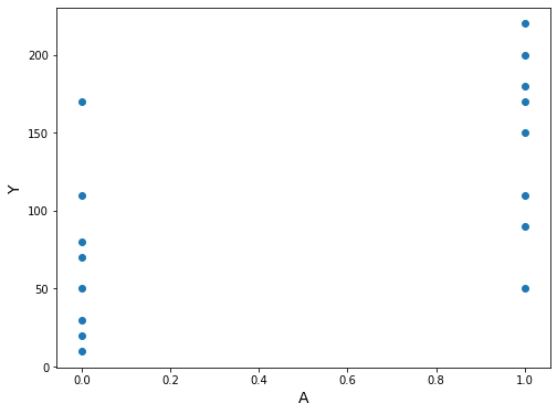
Our estimate of the population mean in the treated is the sample aver- age 146.25 for those with \(A = 1\), and our estimate of the population mean in the untreated is the sample average 67.50 in those with \(A = 0\).
[6]:
df1.groupby('A').describe()
[6]:
| Y | ||||||||
|---|---|---|---|---|---|---|---|---|
| count | mean | std | min | 25% | 50% | 75% | max | |
| A | ||||||||
| 0 | 8.0 | 67.50 | 53.117121 | 10.0 | 27.5 | 60.0 | 87.5 | 170.0 |
| 1 | 8.0 | 146.25 | 58.294205 | 50.0 | 105.0 | 160.0 | 185.0 | 220.0 |
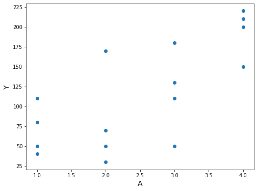
“Now suppose treatment \(A\) is a polytomous variable that can take 4 possible values”. Now suppose treatment \(A\) is a polytomous variable that can take 4 possible values: no treatment \((A = 1)\), low-dose treatment \((A = 2)\), medium-dose treatment \((A = 3)\), and high-dose treatment \((A = 4)\).
[7]:
df2 = pd.DataFrame({
    'A': [
        1, 1, 1, 1, 2, 2, 2, 2,
        3, 3, 3, 3, 4, 4, 4, 4
    ],
    'Y': [
        110, 80, 50, 40, 170, 30, 70, 50,
        110, 50, 180, 130, 200, 150, 220, 210
    ]
})
[8]:
fig, ax = plt.subplots(figsize=(8, 6))

ax.scatter(df2['A'], df2['Y'])
ax.set_xlabel('A', fontsize=14)
ax.set_ylabel('Y', fontsize=14);
[9]:
df2.groupby('A').describe()
[9]:
| Y | ||||||||
|---|---|---|---|---|---|---|---|---|
| count | mean | std | min | 25% | 50% | 75% | max | |
| A | ||||||||
| 1 | 4.0 | 70.0 | 31.622777 | 40.0 | 47.5 | 65.0 | 87.5 | 110.0 |
| 2 | 4.0 | 80.0 | 62.182527 | 30.0 | 45.0 | 60.0 | 95.0 | 170.0 |
| 3 | 4.0 | 117.5 | 53.774219 | 50.0 | 95.0 | 120.0 | 142.5 | 180.0 |
| 4 | 4.0 | 195.0 | 31.091264 | 150.0 | 187.5 | 205.0 | 212.5 | 220.0 |
Program 11.2
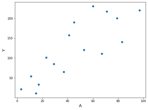
Finally, suppose that treatment \(A\) is a variable representing the dose of treatment in mg/day, and that it takes integer values from 0 to 100 mg. This creates a problem: how can we estimate the mean of the outcome \(Y\) among individuals with treatment level \(A = 90\) in the target population?
上面的描述表明,我们不能总是让数据“为自己说话”以获得有意义的估计。相反,我们经常需要用模型来补充数据,如我们在下一节中所述。
[34]:
A, Y = zip(*(
    (3, 21),
    (11, 54),
    (17, 33),
    (23, 101),
    (29, 85),
    (37, 65),
    (41, 157),
    (53, 120),
    (67, 111),
    (79, 200),
    (83, 140),
    (97, 220),
    (60, 230),
    (71, 217),
    (15, 11),
    (45, 190),
))
[35]:
df3 = pd.DataFrame({'A': A, 'Y': Y, 'constant': np.ones(16)})
[36]:
fig, ax = plt.subplots(figsize=(8, 6))

ax.scatter(df3.A, df3.Y)
ax.set_xlabel('A', fontsize=14)
ax.set_ylabel('Y', fontsize=14);
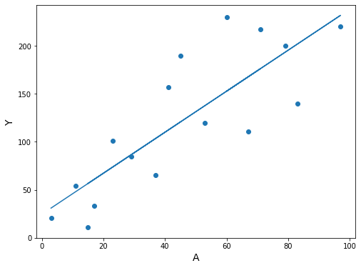
“The values \(\hat{\theta}_0\) and \(\hat{\theta}_1\) can be easily computed using linear algebra, as described in any statistics textbook.”
Briefly, make \(X\) be the matrix with ones in the first column and \(A\) in the second column, and make \(Y\) an \(n \times 1\) matrix. Then \(\hat{\theta}_0\) and \(\hat{\theta}_1\) are calculated as \(\hat\theta = (X^TX)^{-1}X^TY\)
[37]:
X = np.ones((df3.shape[0], 2))        # make X a matrix of ones
X[:, 1] = df3.A                       # replace second column with A
Y = np.array(df3.Y).reshape((-1, 1))  # make Y an n x 1 matrix

theta = np.linalg.inv(X.T.dot(X)).dot(X.T).dot(Y)
theta
[37]:
array([[24.54636872],
       [ 2.13715198]])
[38]:
print("theta0 est.: {:>5.2f}".format(theta[0][0]))
print("theta1 est.: {:>5.2f}".format(theta[1][0]))
theta0 est.: 24.55
theta1 est.:  2.14
[39]:
expectation_at_90 = theta[0][0] + 90 * theta[1][0]
print("E[Y|A=90] est.: {:>5.1f}".format(expectation_at_90))
E[Y|A=90] est.: 216.9
We can also compute this with a statistics package, like Statsmodels, which will also give us confidence intervals and other values
[40]:
ols = sm.OLS(Y, df3[['constant', 'A']])
res = ols.fit()
[41]:
summary = res.summary()
summary.tables[1]
[41]:
| coef | std err | t | P>|t| | [0.025 | 0.975] | |
|---|---|---|---|---|---|---|
| constant | 24.5464 | 21.330 | 1.151 | 0.269 | -21.202 | 70.295 |
| A | 2.1372 | 0.400 | 5.347 | 0.000 | 1.280 | 2.994 |
Initially, it wasn’t clear how to get confidence intervals for expected values from Statsmodels, so the next cells calculate them from scratch.
[42]:
n = df3.shape[0]
yvar = (res.resid * res.resid).sum() / (n - 2)  # = res.mse_resid
xval = np.array([[1, 90]])
X = df3[['constant', 'A']]
XpXinv = np.linalg.inv(np.dot(X.T, X))
se_mean = np.sqrt(yvar * np.dot(xval, np.dot(XpXinv, xval.T)))[0, 0]
[43]:
t = scipy.stats.t.ppf(0.975, n - 2)
ypred = res.predict([[1, 90]])[0]
print('           estimate      95% C.I.')
print(
    'E[Y|A=90]   {:>6.2f}   ({:>6.2f}, {:>6.2f})'.format(
        ypred, ypred - t * se_mean, ypred + t * se_mean
))
           estimate      95% C.I.
E[Y|A=90]   216.89   (172.15, 261.63)
Here’s an easier way to calculate the confidence intervals, contributed by GitHub user @pettypychen
[20]:
pred = res.get_prediction(exog=[1, 90])
pred.summary_frame().round(2)
[20]:
| mean | mean_se | mean_ci_lower | mean_ci_upper | obs_ci_lower | obs_ci_upper | |
|---|---|---|---|---|---|---|
| 0 | 216.89 | 20.86 | 172.15 | 261.63 | 112.27 | 321.51 |
[21]:
fig, ax = plt.subplots(figsize=(8, 6))

ax.scatter(df3.A, df3.Y)
ax.plot(df3.A, res.predict(df3[['constant', 'A']]))
ax.set_xlabel('A', fontsize=14)
ax.set_ylabel('Y', fontsize=14);
(Still Program 11.2)
“Let us return to the data in Figure 11.1.”
[22]:
df1['constant'] = 1
[23]:
ols = sm.OLS(df1['Y'], df1[['constant', 'A']])
res = ols.fit()
[24]:
res.summary().tables[1]
[24]:
| coef | std err | t | P>|t| | [0.025 | 0.975] | |
|---|---|---|---|---|---|---|
| constant | 67.5000 | 19.716 | 3.424 | 0.004 | 25.213 | 109.787 |
| A | 78.7500 | 27.883 | 2.824 | 0.014 | 18.947 | 138.553 |
[25]:
est_at_0 = res.params[0]
est_at_1 = res.params[0] + res.params[1]
print("E[Y|A=0] est.: {:>6.2f}".format(est_at_0))
print("E[Y|A=1] est.: {:>6.2f}".format(est_at_1))
E[Y|A=0] est.:  67.50
E[Y|A=1] est.: 146.25
Program 11.3
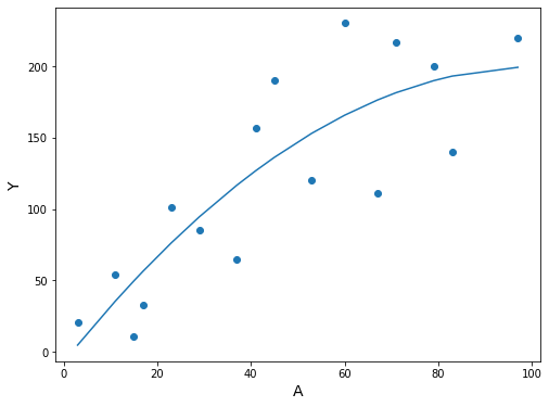
Starting from the same data as Section 11.2, Program 11.2
[26]:
df3['A^2'] = df3.A * df3.A
[27]:
ols = sm.OLS(df3.Y, df3[['constant', 'A', 'A^2']])
res = ols.fit()
[28]:
summary = res.summary()
summary.tables[1]
[28]:
| coef | std err | t | P>|t| | [0.025 | 0.975] | |
|---|---|---|---|---|---|---|
| constant | -7.4069 | 31.748 | -0.233 | 0.819 | -75.994 | 61.180 |
| A | 4.1072 | 1.531 | 2.683 | 0.019 | 0.800 | 7.414 |
| A^2 | -0.0204 | 0.015 | -1.331 | 0.206 | -0.053 | 0.013 |
[29]:
df3.sort_values('A', inplace=True)

fig, ax = plt.subplots(figsize=(8, 6))

ax.scatter(df3.A, df3.Y)
ax.plot(df3.A, res.predict(df3[['constant', 'A', 'A^2']]))
ax.set_xlabel('A', fontsize=14)
ax.set_ylabel('Y', fontsize=14);

The expected value and confidence interval can be obtained with the method contributed by @pettypychen above
[30]:
pred = res.get_prediction(exog=[1, 90, 90**2])
pred.summary_frame().round(2)
[30]:
| mean | mean_se | mean_ci_lower | mean_ci_upper | obs_ci_lower | obs_ci_upper | |
|---|---|---|---|---|---|---|
| 0 | 197.13 | 25.16 | 142.77 | 251.49 | 89.63 | 304.62 |
解读知识点
估计置信区间
[9]:
%matplotlib inline

import warnings
warnings.filterwarnings('ignore')

import numpy as np
import pandas as pd
import statsmodels.api as sm
import scipy.stats
import matplotlib.pyplot as plt
[10]:
A, Y = zip(*(
    (3, 21),
    (11, 54),
    (17, 33),
    (23, 101),
    (29, 85),
    (37, 65),
    (41, 157),
    (53, 120),
    (67, 111),
    (79, 200),
    (83, 140),
    (97, 220),
    (60, 230),
    (71, 217),
    (15, 11),
    (45, 190),
))

df3 = pd.DataFrame({'A': A, 'Y': Y, 'constant': np.ones(16)})

df3['A^2'] = df3.A * df3.A

ols = sm.OLS(df3.Y, df3[['constant', 'A', 'A^2']])
res = ols.fit()

summary = res.summary()
summary.tables[1]
[10]:
| coef | std err | t | P>|t| | [0.025 | 0.975] | |
|---|---|---|---|---|---|---|
| constant | -7.4069 | 31.748 | -0.233 | 0.819 | -75.994 | 61.180 |
| A | 4.1072 | 1.531 | 2.683 | 0.019 | 0.800 | 7.414 |
| A^2 | -0.0204 | 0.015 | -1.331 | 0.206 | -0.053 | 0.013 |
[11]:
df3.sort_values('A', inplace=True)
fig, ax = plt.subplots(figsize=(8, 6))
ax.scatter(df3.A, df3.Y)
ax.plot(df3.A, res.predict(df3[['constant', 'A', 'A^2']]))
ax.set_xlabel('A', fontsize=14)
ax.set_ylabel('Y', fontsize=14);
[12]:
pred = res.get_prediction(exog=[1, 90, 90**2])
pred.summary_frame().round(2)
[12]:
| mean | mean_se | mean_ci_lower | mean_ci_upper | obs_ci_lower | obs_ci_upper | |
|---|---|---|---|---|---|---|
| 0 | 197.13 | 25.16 | 142.77 | 251.49 | 89.63 | 304.62 |